Visual
guidelines
This guide lays out the essential standards that bring the Showpad brand to life, from our color system and typography to our photography and voice. These guidelines ensure everywhere our employees and customers encounter Showpad reflects the human warmth and technical precision at our heart.
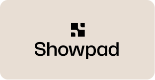
Logo
Primary Lockup | Black

Primary Lockup | White

Primary Lockup clearspace
Secondary Lockup | Black

Secondary Lockup | White

Secondary Lockup clearspace
Incorrect Usage


Partnerships

Colors
The palette has been simplified to three primary colors with their secondary tones to give more range. The primary colors are supported by a set of neutrals to be predominantly used as airy, elegant backgrounds.
Navy
As a shade that sits beautifully between Brick and Plum, Navy speaks to our maturity as a global enterprise solution and imbues our brand with a sense of timeless elegance.
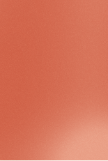
Brick
Inspired by Belgium’s cobblestone boulevards and Flemish masonry architecture, Brick brings warmth and texture.
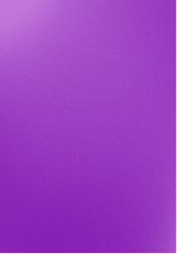
Plum
Bringing a facet of our playful past along, this refreshed hue of purple is more in harmony with brick and also inspired by Belgium, from the cuberdons candies to the Royal Order of Leopold to the bluebells carpeting the Hallerbos forest.
Sand
A set of neutrals to be predominantly used as airy, elegant backgrounds.
Cream
A set of neutrals to be predominantly used as airy, elegant backgrounds.
White
A set of neutrals to be predominantly used as airy, elegant backgrounds.
Navy
As a shade that sits beautifully between Brick and Plum, Navy speaks to our maturity as a global enterprise solution and imbues our brand with a sense of timeless elegance.
Brick
Inspired by Belgium’s cobblestone boulevards and Flemish masonry architecture, Brick brings warmth and texture.
Plum
Bringing a facet of our playful past along, this refreshed hue of purple is more in harmony with brick and also inspired by Belgium, from the cuberdons candies to the Royal Order of Leopold to the bluebells carpeting the Hallerbos forest.
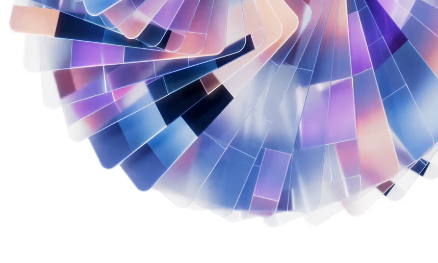
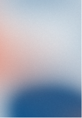
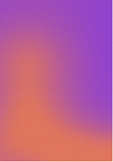
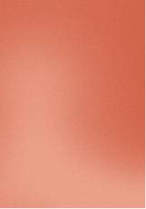
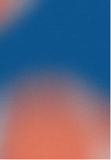
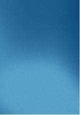
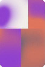
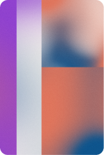
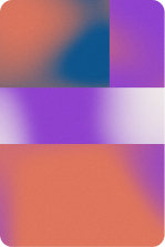
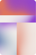
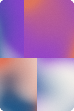
Gradient Palette
Our three brand hues combine in endless gradients to form a collaboration of color. These gradients work as canvases for other other visual elements in both light and dark modes.
Switch background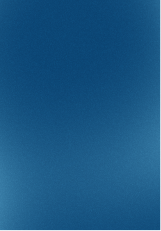


Typography
Our three brand fonts — a serif, sans, and mono — are core to our identity. Consistent use creates recognition, builds trust, and ensures every expression feels cohesive and intentional.
Custom fonts
Nib, inspired by a stone carving Belgian designer Dries Wiewauters saw, Nib was first crafted for the MSK — the Museum of Fine Arts in Ghent — in close collaboration with Ruud Ruttens, the head of the MSK design department.
Elegantly bold, its subtly varying line widths nod to calligraphy, and its strong serifs to chiseled granite.
Nib is both warm and accessible and precise and authoritative pending the styling, allowing it be applied to a wide range of contexts — but always with the clear human hand working in stone and ink.
A perfect foil to our streamlined Söhne sans.
1- Please turn ligatures OFF when using.
2- Please use the alternative "g" and "a" when using.
3- Please use Nib sparingly in H1s and H2s alongside Sohne and Mono. It's an expressive font so needs to be balanced.
Google fonts
While our primary brand typography defines our visual identity, we include approved Google font alternatives to ensure consistency and accessibility across all platforms.
Backup fonts are necessary when:
- Our primary fonts are not available (e.g., in Google Slides, web platforms, limited email tools, or external partner documents).
- Teams or external vendors do not have the licensed brand fonts installed.
- Technical limitations require web-safe or Google-hosted typography.
By defining specific Google font alternatives, we protect brand consistency, maintain readability, and ensure our visual identity remains recognizable across every touchpoint — without compromising usability or collaboration.
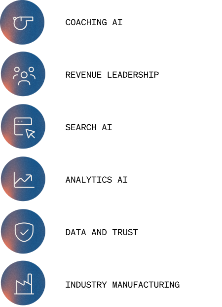
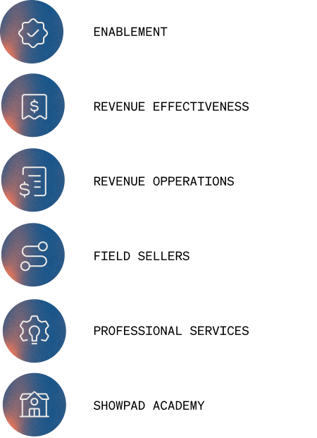
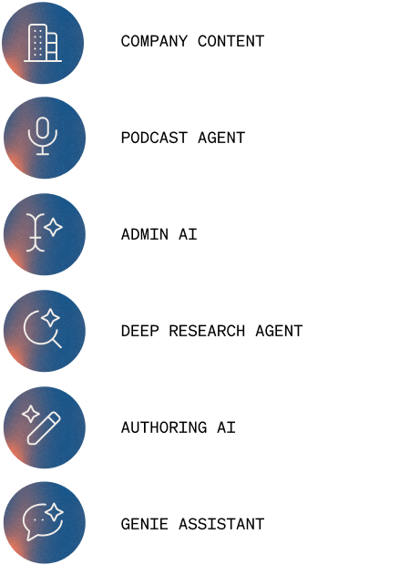
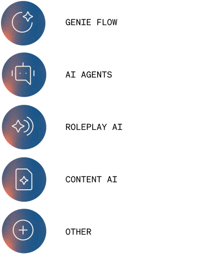
Iconography
Icons on navy are primarily what should be used. Alternate versions on brick and plum are available for use on navy background slides.
Shapes


Our gradients and photography are brought to life in a new element — a systemized rectangle named the Composite.The external shape echoes an iPad — the ideal tool for facilitating meaningful, in-person client interactions and a nod to the origin story of Showpad. And the interior linework is as multi-faceted and fluid as our customers’ needs: their products, market segments, team workflows, seller competencies, buyer insights.
Together the consistent form and the composable grid create a metaphor for how companies build with Showpad — a comprehensive system without the one-size-fits-all constraints, but instead a composition shaped entirely by each customer.
This duality reflects Showpad: a stable, enterprise-ready foundation with a dynamic layer of AI-driven insight, creativity, and productivity.
By mixing these elements in endless ways, we will create a flexible, intentional visual language.

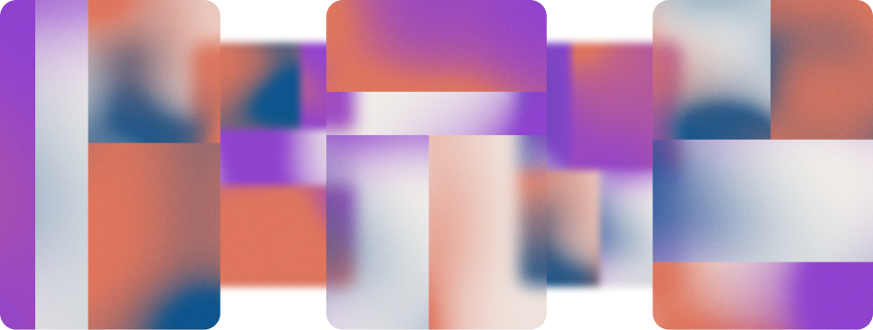
The Composites interact with each other, as they are layered into compositions. They have a subtle transparency, like glass, softening elements behind them — adding depth and interest.
Images
![[background image] image of a workspace (for a mobile gaming)](https://cdn.prod.website-files.com/686ce275ae453daa431a56be/6984a74d29013ea6db26eaf7_Stocksy_unlicensed_comp_watermarked_7046999.jpg)


![[digital project] image of creative illustrations on a laptop screen](https://cdn.prod.website-files.com/686ce275ae453daa431a56be/6984a74d18042a14fdd59f32_GettyImages-2212560386.jpg)


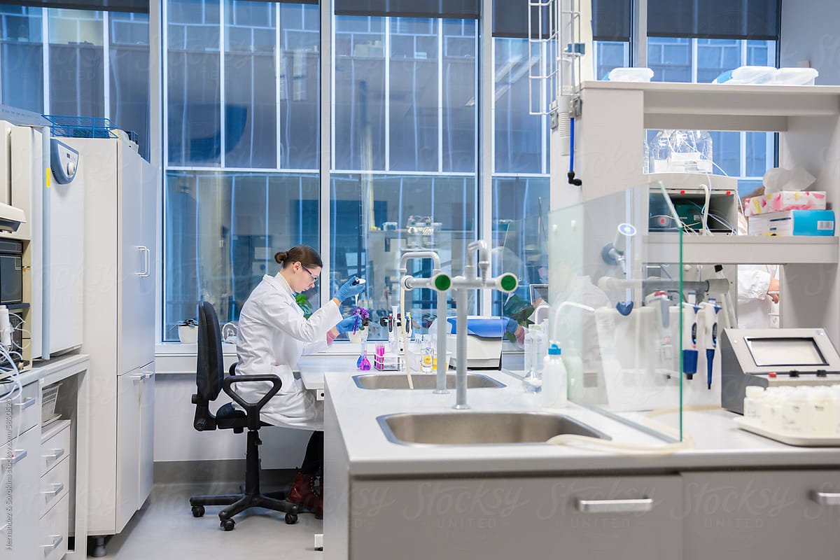
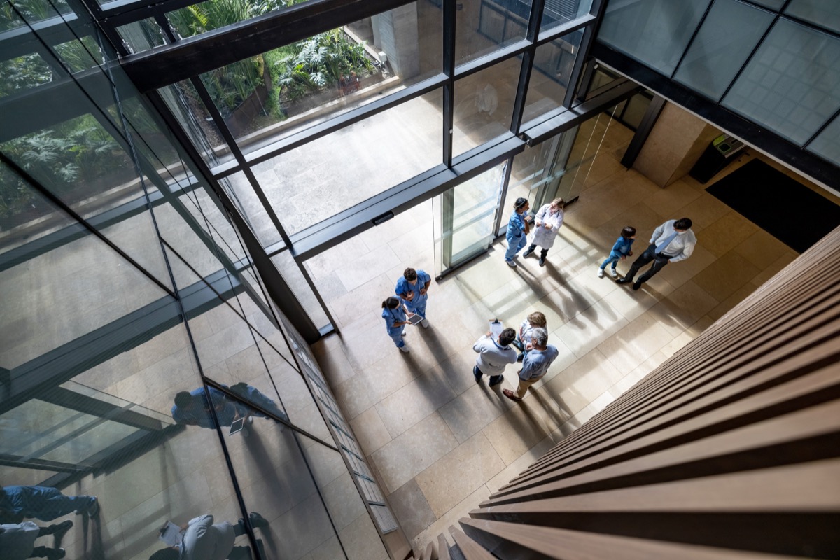
Our Guiding Principles
- Window light or large diffused sources
- Soft shadow transitions
- Capture people actively using devices in real workflows
- Show micro-moments: thinking, communicating, moving, deciding. The conversation should appear more interesting than the machine.
- Don’t overuse generic subject pointing and smiling at screen
- Modern architecture. Clean, uncluttered spaces.
- Elevated business casual wardrobe.
Tailored but not stiff. - If showing interior shots, subjects should ideally be in transition (between meetings in a hallway, at the elevator, walking down the stairs, etc.)
- Subjects should feel capable, focused, and in the zone. Never static or passive.
- Slight low angles or environmental scale
- Natural movement (walking, working, interacting)
- Expressions that feel engaged, not performative


